0 com

New Studio

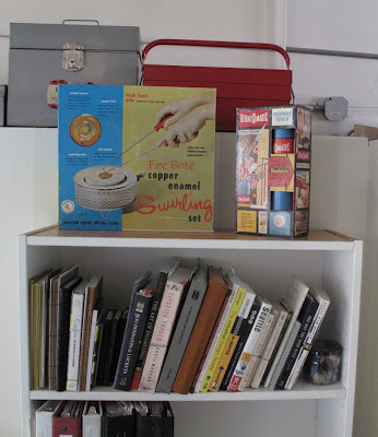
Stephanie Tomczak  and I have been looking for a studio space to share, since I got back in Seattle, and we finally found one. We share the building with two painters and a maritime IT guy. Today I finished unpacking my things and feel pretty good about the space. The room is fairly big and we've split it down the middle. The floor is concrete, so not exactly level. Our space has a wooden platform/stage in it to make the floor level. I've set up my studio area on the stage, and my office area on the concrete floor. I picked up the old metal desk and the lockers from a surplus warehouse.

I have out the wooden levels and my plumb bobs that I made for the Persen House exhibition. It seemed pretty fitting since most things aren't quite level in this space either.


0 com

ParaNorman

I can't wait to see this movie, partially because it was made right down the road from me (well 3 hours down the road) and that someone I know worked on this movie. The incredible metalsmith Miel Paredes creates armatures for LAIKA, and this video really highlights how LAIKA uses traditional craft methods to create fantastic stop-motion animated movies, and I love a miniature.

 
0 com

Just Funny


Being from Richmond, VA, I was pretty excited to see this. I love how serious his delivery is.


0 com

Kiev


I LOVE A MINIATURE!


MiniLook Kiev from threeshot on Vimeo.

 LOVE THEM!

0 com

Hello Again


I've been out of contact as I was finishing up my graduate school work, packing to move cross-country, moving cross-country, and trying to settle back in in Seattle. Also three days after I arrived in Seattle I started teaching summer session at North Seattle Community College, which has been great and my students are super awesome. I may have missed teaching those Seattleites – a city of over-achievers.

I've uploaded photos of our cross-country drive to my flickr, so check em out.

Here is the route that we took:


Today I came across Design Bird blog, a Swedish designer blogging about, you guessed it, design. But, I was super excited when I came across this post about her love of things copper. It was so nice to see a designer appreciate the often undervalued metal (well outside of rain gutters and plumbing). I especially liked this sexy copper bicycle (from Olsthoorn Bicycles) that she has in her post. 


0 com

MFA Thesis Exhibition

Well, I am officially done with school. I moved out of New Paltz last week and am recovering at my parents' house in DC for a few days before I start my cross-country move back to Seattle.

Here are a couple of images from my thesis show: Solipsistic Apparatus. 


This work explores systems, both man-made and within the human body. I am interested in the similarities, and the intersection between the two. I have been exploring these concepts through material investigations and the creation of wearable jewelry. There is a record of the passage of time visible in bodies and the built environment, through deterioration, repairs and additions to structures. These works endeavor to construct their own system, visually creating a link between the built and the bodily, as an attempt to symbolize our corporeal existence. Through wearing, the jewelry is activated, creating parallels with the body while also working incongruously with the body – encircling it but not intersecting it.

Photos of installation taken by Keith Ferris.

You can see more images on my website and flickr.


0 com

Silver & Light


SILVER & LIGHT from Ian Ruhter on Vimeo.


0 com

First Year Work


As I am getting work ready for my thesis exhibition, I was looking through work, that I made last year (2010-2011), in grad school, and decided to add some photos of that work to my website. When I came into grad school I was interested in blood cells. I was thinking a lot about how we are made up of blood, and about all we do to contain that blood in our bodies. I began thinking about bringing that blood to the outside as a visual element. The idea of blood cells spilling off of us. This was the last piece I made right before grad school.


Then when arriving at New Paltz we had 10 days to make 10 pieces, so continuing my thinking about blood cells, but moving into also thinking about the vascular system, I created this ring and this brooch. 


These explorations in my first year, later transitioned into a broader thinking about systems, which inspired my thesis work. You can see more of the pieces that I made last year on my website


0 com

Posters Are Up


And my name is on them, so it looks like I'll be graduating soon.


0 com

Persen: Place & Things – The Catalog


Previously I wrote about an installation of work that the MFA at New Paltz created in response to the Persen House in Kingston, NY. Well, the catalog of the installation is finally finished and available online for purchase. Hyun and myself did the all design work on the catalog, and I'm super happy to see all of our efforts finally completed.


You can preview/purchase the catalog at Lulu.com.


0 com

Luminaris


This is a cute short stop-motion animation film by Juan Pablo Zaramella. A sweet little thing to watch on a Monday morning. 


0 com

Parts Bin


I've realized that I now have a "parts bin" at my bench. Full of test parts, and parts that are intended for future pieces.


0 com

SNAG Pin Exchange


I just came across this photo the other day. This is a shot of the pins that I made last year for the SNAG pin exchange. They were plastic animal/nun/baby mash-ups. I think my favorites are probably the baby chickens.


0 com

System R3529


Here is the original image that I used for the front of my postcard.


 System R3529, Sterling Silver, Copper, Steel and Graphite, 2012

0 com

Show Cards


My cards came in today for the MFA thesis exhibition, and I'm pretty excited about them.


0 com

New Paltz Ring


As I've mentioned before, all of the Metal graduate students are going to Munich in March for Schmuck 2012, and we have this fund raiser project, well, to raise funds for the trip. So, we have designed class rings of sorts. We are calling them "Memento Rings". Having never been a class ring wearing kind of person before, I am pretty excited about these.

The Morse Code Ring was designed by Sara Glaberson, then modeled in Rhino by myself, then 3D printed in stainless steel. I now have one of these rings and am super excited to wear it. You can order your own ring from our blog http://npmementoring.blogspot.com/ . Here are some pictures of it:


0 com

Art Thoughtz


Thinking about sharing this Hennessy Youngman video with my class on Tuesday.


0 com

Work from the Fall


Here are a couple of images of work that I completed at the end of the fall semester. They are painted copper forms.


0 com

Schmuck 2012


This year all of the New Paltz Metal graduate students as well as Myra and Jamie are planning on going to Schmuck exhibition in Munich – an international jewelry competition. Interestingly, I heard that they didn't accept any Americans this year.

A few of us (including myself) bought our tickets the other day and made lodging reservations. I've never been to Germany before unless you count a layover at the airport, so I'm pretty excited.


was zahlt/what counts at studio gabi green, gollierstrasse 17


0 com

Copperplate Practice


I've started my Copperplate calligraphy practice. I printed out these sheets on a laser printer with laser printer paper, and I'm using my new Noodler's Ahab pen with the Noodler's Blue-Black ink. I plan on binding these sheets together to create a practice book, but haven't yet. 


I love, love, love this ink color. It even looks nice smeared all over my hands, which is a frequent occurrence with this pen. Next I'd like to get the "Black Swan in English Roses" ink from Noodler's.


I know I'm suppose to use a dip Copperplate pen, but part of my reason to learn Copperplate is to improve my everyday handwriting, and I'm not going to use a dip pen out in the world. I did read on the Fountain Pen Network forum that someone altered the Noodler pen with a Copperplate nib. I might buy another pen and try that. Sounds like it has potential. 


I did get a few great tips from Debi Sementelli, and the one that I keep repeating to myself while I'm practicing is,  "Go slow and think about each letter form. It's very zen like and part of the art of lettering to be appreciated." Very helpful. Thanks Debi!

0 com

Colors


Some yummy colors of polymer that I just mixed up. The yellow looks to me like butter and I want to eat it. Maybe it's time for dinner.


0 com

Sheaffer vs. Noodler


I want to learn to write like this:


Maybe I need a Sheaffer Snorkel FF3 Flex Nib fountain pen. I just ordered a Noodlers Flex Nib pen, and I really love the ethics of this company, so I hope that I like the pen. I've read some mixed reviews about it though.

I did find this video on using the pen. Seems a bit advanced for me, but I'm wiling to give it a try. 


0 com

Calligraphy Pages


Today I created these printable Copperplate practice sheets based on the measurements in Eleanor Winters' Mastering Copperplate Calligraphy: A Step-by-Step Manual. There are two sheet that you can print out and use. One that is a full size 8.5 x 11" portrait, and the other is a landscape with two practice pages. The latter is meant to be double side printed and folded in half to make a practice book for those bookbinder/calligraphers out there. Yes I know, the grain will run perpendicular to the fold, but I'm a rule breaker like that.

You can download the .pdf for the portrait file or the landscape file.

Please let me know what you think. I would also welcome feedback from you pros. Do these seem like good practice layout sheets?


Wait, here's a disclaimer on that – I welcome feedback unless it's some weird picky thing like, "When I print it on my printer at home it doesn't print right, but on my work printer it's fine," because I can't help you with that one. I have to put these disclaimers out there because, having come of age in the punk rock/diy scene, the parochial school crowd often times balks at my "get 'er done" methodology.

Otherwise, download and enjoy. If I'm off on my layout, let me know.


2 com

Calligraphy


Calligraphy – the art of artistic, stylized, or elegant handwriting or lettering.

I found out that Monday January 23rd was National Handwriting Day, so in honor of that I thought I'd write about my new obsession with handwriting.

In my quest to know how to make everything, and my normal style of seeing something and thinking, "I want to learn how to do that." I have this new obsession with handwriting. This interest started on Saturday January 21st when I came across this custom stamp:

Stamp by Besotted Brand
Calligraphy by Debi Sementelli

Debi Sementelli is a very talented calligrapher, who does the lettering for the stamps at Besotted Brand, and also designer of this fantastic and very versatile Belluccia font, done in the Copperplate style.


Seeing this font turned me onto Copperplate calligraphy, which is a style of writing that was very popular during the 19th century. Copperplate calligraphy uses a pointed metal nib that, when pressure is applied, opens up to allow for a wider stroke. Hence the varied line with.

I have dysgraphia, so I have never enjoyed writing by hand, and being able to type on a computer was a godsend for me. Because of the frequent mistakes, when writing by hand, I always tended to do my handwriting with a pencil. I also stopped writing in script when it was no longer required of me (ninth grade). So all of this would pose an even greater challenge in trying to learn calligraphy, especially the beautiful and elegant Copperplate.

But this stamp, and this font, got me thinking about the value of the handmade (wait, I'm in grad school for craft, so aren't I always thinking of the value of the handmade), and more to the point the value of the handwritten in our computer age. Although Belluccia has many variations so that it can have that handwritten look, I prefer the look of the stamp above. Not the perfectly beautiful, but the beautiful because of its imperfection. I appreciate the raw irregular quality of it. It's also interesting to me that in a time when even my two-year-old niece can type, although she can spell or write, that we need to pay someone else to sign our name for us. (that said, I'm totally going to buy the thank you stamp)

So, I'm going to give it a go – the craft of writing by hand. The art of artistic or stylized lettering. I made a journal (with one of my first attempts on the cover) to practice my handwriting in, and acquired a few fountain pens, ink, pointed tip nibs and holders. We will see how it goes. I'm open to any tips and suggestions that people have for this.



0 com

CtrlV

Great way to remember

0 com

Christmas Presents

As anyone who knows me, knows that I love a container. All sorts of containers, but the best are containers within containers. So, Dan got me this fantastic watchmaker's container for Christmas.


He also got me this fantastic engineer's tool box and this vintage butane torch. 


For Dan, I raised this little silver shot glass.


And, here is a sweet little flip book video that my friend Adam Whitney made, illustrating the raising process.